
An Interactive View of Prison Populations Using RGraph
RGraph is a toolkit for the creation of HTML5 canvas graphs. One of the most beneficial aspects of it is that it allows for user interaction with the graph data which allows whoever is using to allow the graph to not only display data but tell a story. Additionally, it gives you all of the tools you need while allowing a great deal of customization so you are able to tweak it to get exactly what you want.
I was interested in the size of prison populations as a percent of the United States population and how this number has grown in the past years. I made a few static graphs to display jail, prison, probation and parole numbers as it relates to the overall population and just the prison numbers. It stirred up an interesting conversation about why the apparent increase exists in the data. While I could add static information boxes all over the graph it would end horribly in clutter and limitations to what can be said.
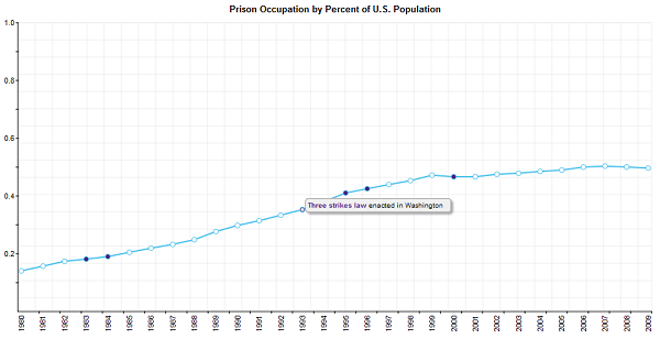
The interactive graph allows for the political environment of each year to speak for itself and point out reasons for the trends. Though the data is somewhat limited by only being from 1980-2009 I would really like to get some older data at the very least starting at 1970 onwards so the “War on Drugs” is more clearly displayed in the data. I’ll probably be taking some time in the next month or so and looking up more data and adding more information to the graph itself.